


Colours affect us in different ways; they can create different feelings and emotions. They can make us feel hungry, relaxed, happy or anxious; and we need to take this into consideration as we build our brand and website. Warm colours like red, yellow and orange can evoke feelings of optimism, happiness and give you energy. However, they can also be associated with danger, hazards and warnings. Did you know that red can even increase your appetite?

Cool colours like green, blue and purple are usually calming and soothing. Purple is sometimes used to spark creativity. If you are in the health, beauty or security industry, the cooler colours would work better for you. I use blue because it is a professional, dependable and calming colour (and let’s face it, trying to get things right online can sometimes be very stressful). I want website visitors to know that they can relax when they get here because they are in good hands and will find the information that they need.

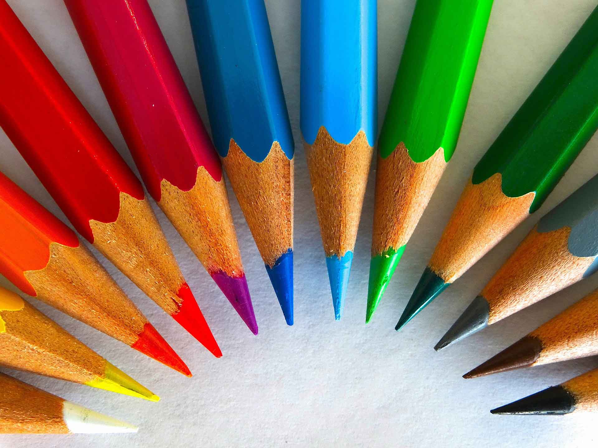
The Effect of Colour
So, the colours we use can affect what impact we have online and in person, and they can impact the popularity of our products. Look at the example below:
Some years ago Heinz ketchup company released a green-colored ketchup. Green. Colored. Ketchup. Yup. The result? It was wildly successful. People loved it and the company made huge revenue in just a few months. The conclusion Heinz drew from this: people love colors. Colors are fun. Let’s make other colored ketchup. So, they went ahead and released pink ketchup, and purple, and orange, etc. Based on their previous success, the company believed that they will be as successful as before. Were they? No. This time it was a colossal failure. No one wanted THAT colored ketchup. The company lost millions of dollars. Then they decided to discontinue other-colored ketchup (besides red) altogether.
So what is the lesson in all of this? What really happened here? It’s possible Heinz never learned the reasons behind this success and failure. William Lidwell, guy theorizing about this stuff, explained it this way:
The reason that green ketchup WAS successful is because we have green tomatoes out there. Ketchup is made from tomatoes. In most cases tomatoes are red. But they are also green. Have you ever seen an orange or a purple tomato? They might be out there, but I haven’t seen them. I actually told this story to a few of my friends, and their reaction to it was disgust. They actually made that face of ‘ew’ even thinking of purple ketchup. They said ‘I remember when that came out. I was disgusted to even look at it.’ The idea of a purple ketchup was incongruent — it did not fit in the natural world, the world of food. Also, the green ketchup was released at the same time that Shrek the movie was released. Shrek is this big green guy that eats green disgusting things. Kids loved the green ketchup because Shrek made green, disgusting food fun.
Here’s what psychology reveals about how people look at things in relation to food and color: we first taste with our eyes.
https://diana-cepsyte.medium.com/

Interesting story, but it reinforces the impact colour can have on our brand and products. Our success will, in part, be determined by the colours that we use.
Colour and your Brand and/or Website
Colour psychology is the science of how colour affects our behaviour. Colour can influence how your customers respond to marketing messages based on the colours you use, it can affect how long they stay on your website and where they navigate to while on your website; and we know from statistics that the longer a visitor stays on your website, the more likely they are to become a customer. What colours are you using or thinking of using in your branding and on your website. Do they convey the correct message? Where are you going to use those colours? A good web designer will take these things into consideration when designing your website.

Colours and their Meanings
Blue – trust, security, loyalty, responsibility, appetite suppressant, safety, peace, relaxing, professional and sometimes cold.
Green – natural, eco-friendly, outdoors, refreshing and symbolises growth.
Yellow – joyful, confidant, happy, creative, warm, positive, laughter and sometimes signals caution. (Note: Yellow tends to reflect more light and can irritate the eyes)
Orange – determined, warm, energetic, friendly and suggests urgency.
Red – passionate, energized, love, danger and also anger.
Black – elegance, luxury, sophistication, authority, power, prestige, serious and can be used to evoke mystery.
